Modern Mortgage
Website UI– Clean, Fast & Client-Focused
A digital solution that simplifies mortgage exploration through trust-driven design and seamless user experience.
Tools Used

Project overview
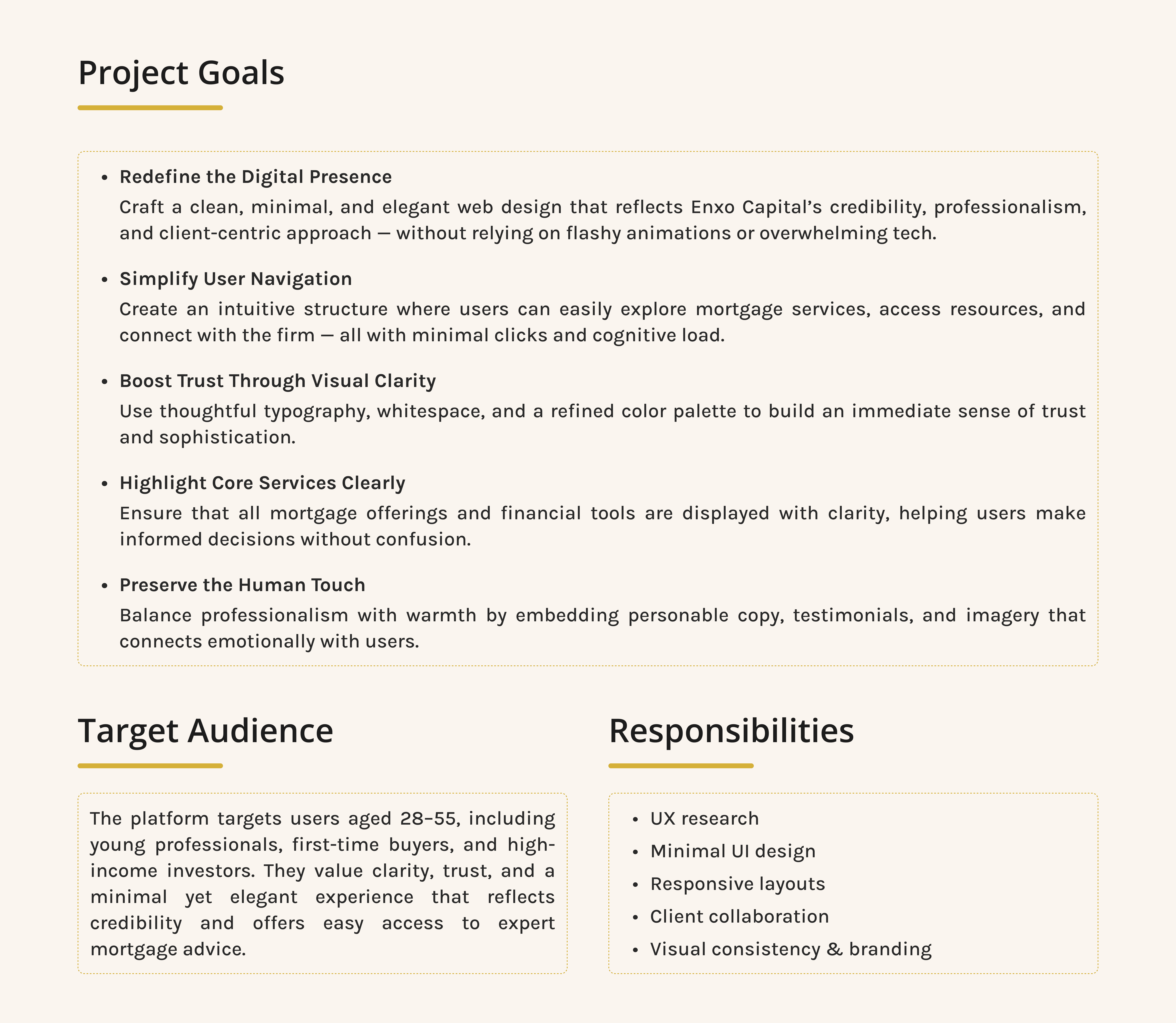
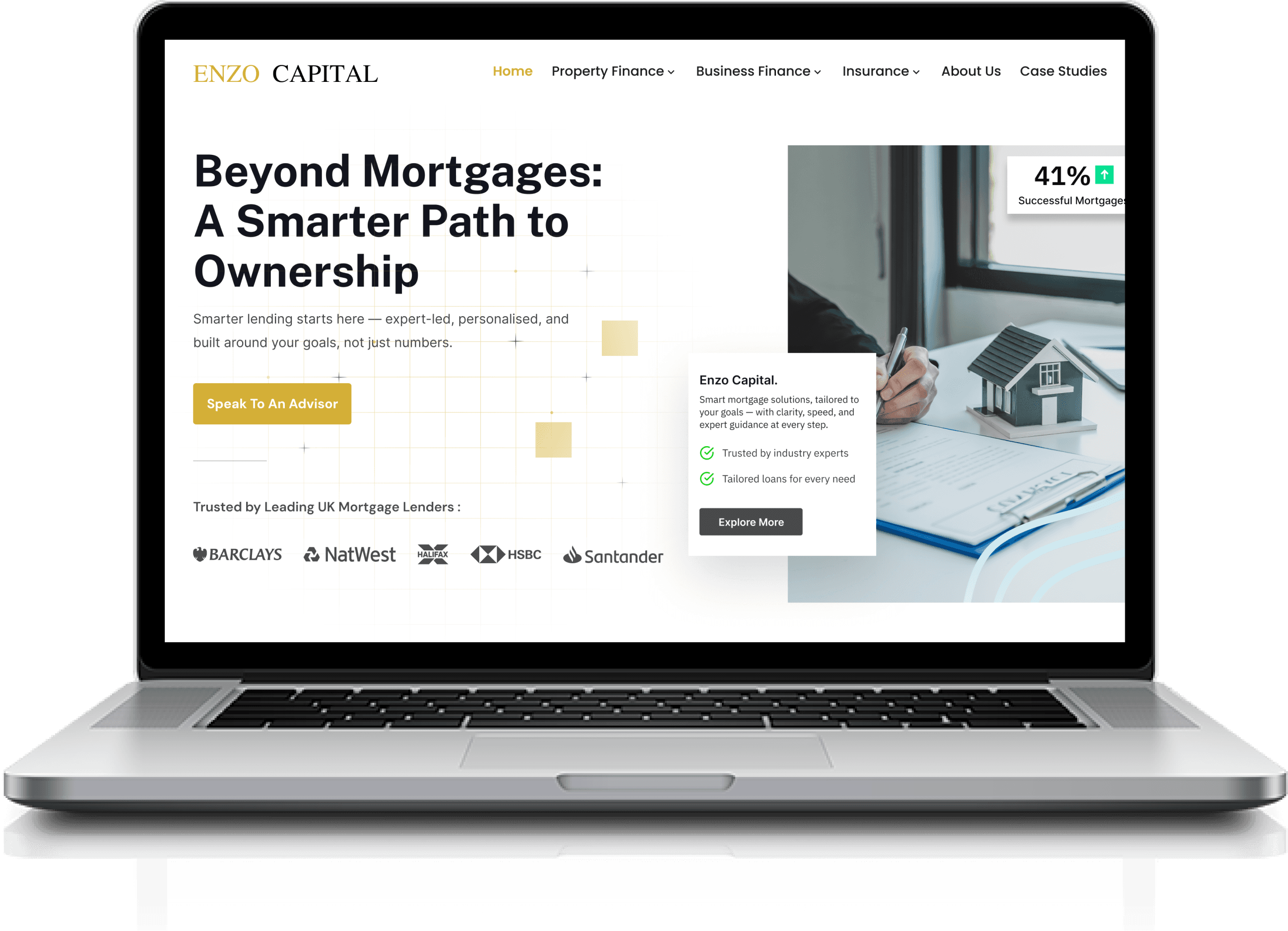
In this project, I partnered with a London-based mortgage firm to completely revamp their existing website, aiming to shift the brand’s digital presence toward a cleaner, more elegant, and minimalist design direction.
The client emphasized the need for simplicity and clarity over complex animations or overly technical visuals. My goal was to strike the perfect balance between sophistication and accessibility — crafting a seamless user experience that instills trust and professionalism, while maintaining a refined and modern aesthetic.
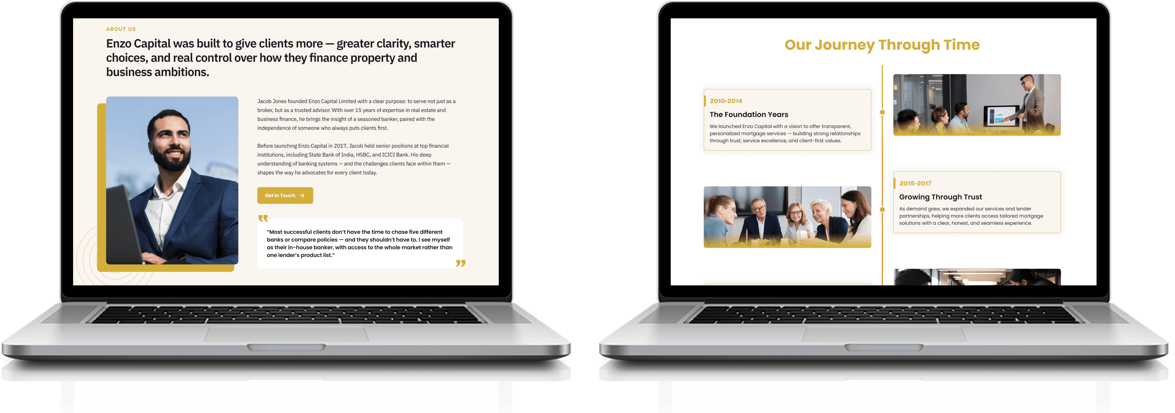
With user-centric layouts, a neutral color palette, clear content hierarchy, and intuitive navigation, this website redesign is a fresh take on how financial services can look approachable and contemporary without relying on heavy tech gimmicks.
Problem Statement
The existing website lacked the visual appeal and clarity needed to resonate with today’s digital-first audience. Though functional, the older design was cluttered, uninspiring, and failed to reflect the brand's credibility, professionalism, and client-first approach in a highly competitive financial market.
The client approached with a clear vision:
“We don’t want overly technical designs or complex animations. We just want something calm, minimal, elegant — but still modern enough to make users trust us and stay engaged.”
This meant the challenge was not just about aesthetics — it was about precision. The new design needed to simplify complex financial offerings, highlight key services, and create a refined user journey that feels smooth and trustworthy, all while avoiding flashy or overwhelming visuals.
In short, the task was to design a website that feels quietly powerful — a digital space that speaks confidence, not with noise, but with grace.
Design Process
My design process followed a user-centered approach with an emphasis on simplicity, clarity, and elegance. While not strictly linear, the flow was rooted in design thinking to create an intuitive and trustworthy mortgage experience.
Empathize
Studied users to uncover behavior, needs, expectations.
Define
Identified issues in navigation, clarity, responsiveness.
Ideate
Sketched clean flows prioritizing trust and clarity.
Prototype
Created responsive, elegant, emotionally resonant UI.
Test
Validated and refined through client-driven feedback.
User Research
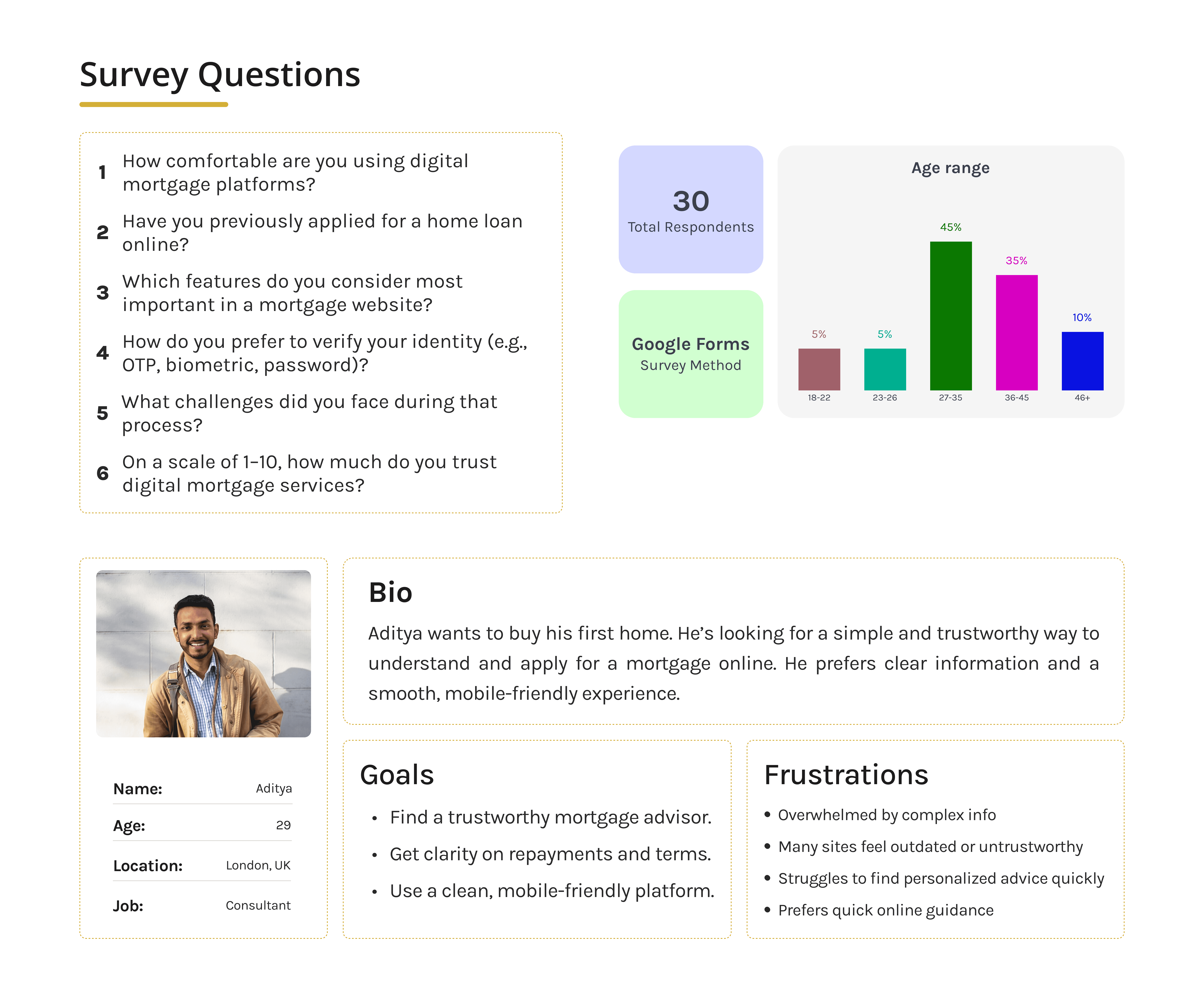
To design a more intuitive and trustworthy mortgage experience, we conducted extensive user research to understand the behaviors, expectations, and pain points of potential users. Our process involved conducting in-depth interviews with five individuals representing key demographics—first-time homebuyers, working professionals, and investors—ranging from ages 28 to 55.
The research revealed that users seek simplicity, credibility, and quick access to relevant services. Many participants expressed frustration with overly technical language, cluttered interfaces, and a lack of mobile responsiveness. Trust emerged as a recurring theme—users needed to feel confident in the platform before taking any financial action. These insights helped shape our design goals: creating a premium, minimal UI that clearly communicates value, guides users smoothly, and is fully optimized for mobile and desktop usage alike.
Design Screens
HIGH FIDELITY
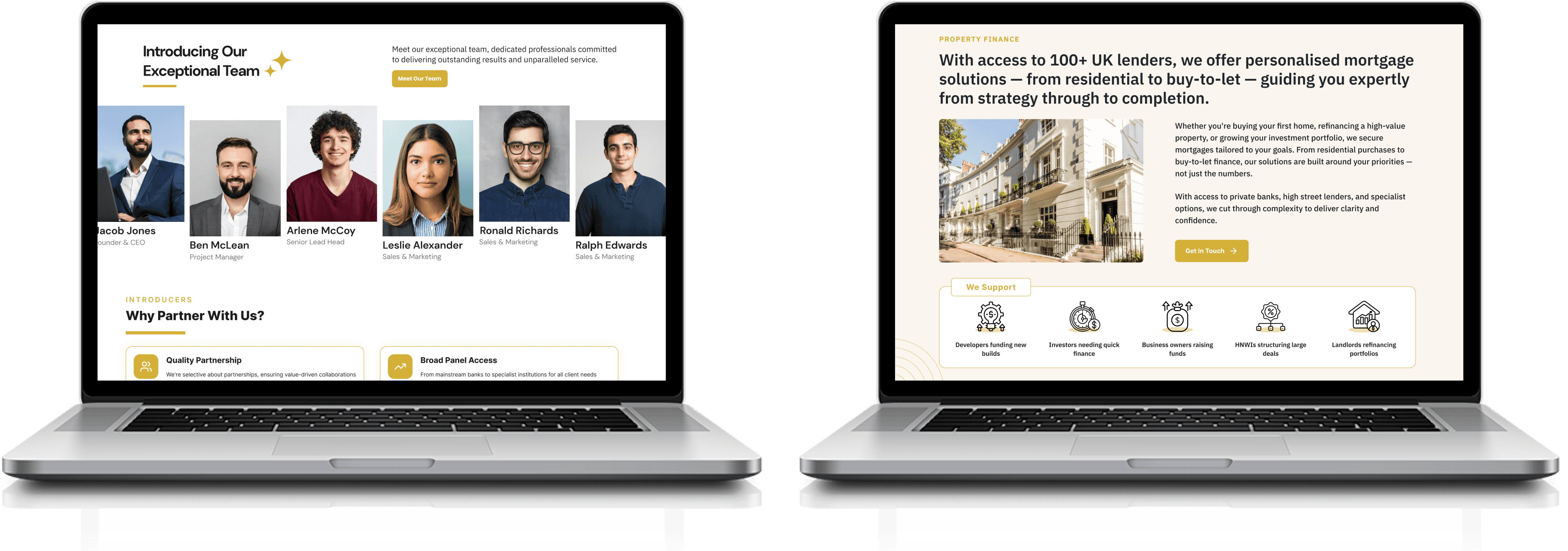
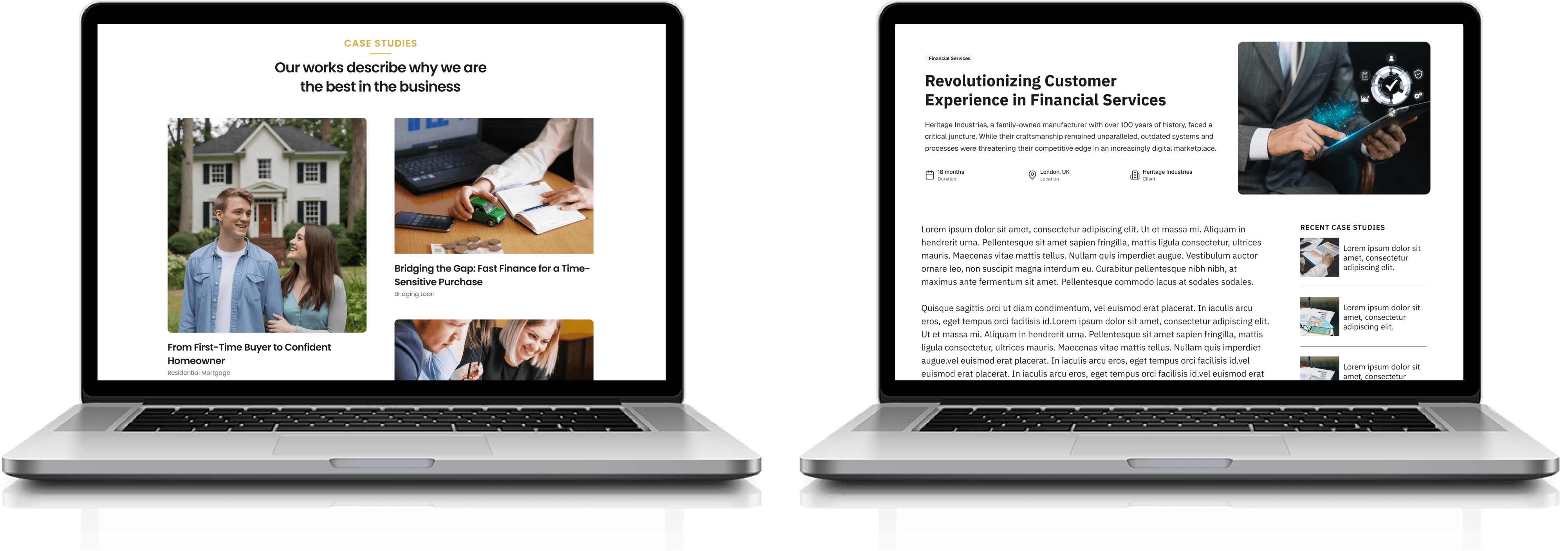
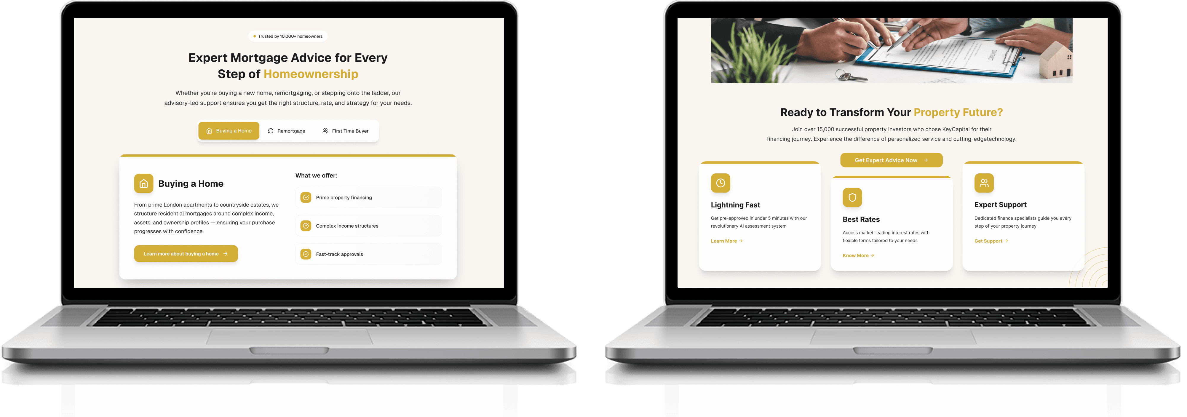

Typography & Colors
Aa
Inter
A B C D E F G H I J K L M N O P Q R S T U V W X Y Z
a b c d e f g h i j k l m n o p q r s t u v w x y z
1 2 3 4 5 6 7 8 9 10
Aa
Poppins
A B C D E F G H I J K L M N O P Q R S T U V W X Y Z
a b c d e f g h i j k l m n o p q r s t u v w x y z
1 2 3 4 5 6 7 8 9 10
Primary Color
#D4AF37
Secondary Color
#FAF5EF
Text Color
#1C1C1C
Text Color
#282828
Text Color
#808080
Take Away
Working on this project deepened my understanding of how thoughtful design can simplify complex services like mortgage platforms. I learned the importance of balancing user trust with clean, accessible UI, and how small design decisions—like typography, spacing, or button hierarchy—can greatly impact user confidence and experience.
This case study also reinforced how crucial collaboration, clarity, and consistent visual language are in creating a premium digital product that resonates with both business goals and user needs.
Thanks for watching.
Designer